For seven years, it’s been with us: the little cabinet with the red cape, which we affectionately called “Schränki” behind the scenes. It was on every company car, every business card, and every social media post. As of September 10, 2026, the Cabinetheroes logo has a new look—calmer, more minimalist, more mature. In this post, we’ll explain what’s changed about the logo, why now was the right time for this update, and what will deliberately remain the same for you as a customer when it comes to the service you’ve come to expect.
Schränki Grows Up: The Story Behind the Old Logo
Seven years ago, when Cabinetheroes was founded in Zirndorf, the idea was incredibly simple: custom-made cabinets, built by true craftsmen, designed right in people’s homes with the goal of building the best cabinets in Germany. Together with our first partners starting in 2021, we also created the face of the young brand—a small, comic-book-style cabinet with a red cape, which we quickly dubbed “Schränki” internally. Likeable, eye-catching, and a bit tongue-in-cheek. Just right for a young franchise network establishing itself in the market.
This logo has grown with us ever since: on our regional partners’ vehicles, on business cards, in the press, and in every post on Instagram and LinkedIn. Over the years, what started as a handful of founding partners has grown into a network spanning four countries—and Schränki has become the familiar face of this evolution.
That’s exactly what makes deciding on a new logo so difficult. A symbol that has appeared on every car and every invoice for years also embodies a piece of our company’s history. That’s why we hesitated briefly internally before deciding to make the change—not out of uncertainty, but out of respect for what the old logo stood for.
From Startup to Network—Why a New Logo Now?
That original idea has since grown into something much bigger. Today, more than 50 cabinetmakers and carpenters in Germany, Austria, Luxembourg, and the Netherlands are part of Cabinetheroes—a network of experienced cabinetmakers and carpenters who design and build custom cabinet solutions every day. Nearly 10,000 customers have already worked with us to create their custom cabinets, and we’ve been featured in trade magazines, on the radio, and on television. What started as an idea with a cartoon-style mascot has grown into an established franchise system.
When the image no longer matches the substance
That’s exactly what led to the question we’ve been asking ourselves internally for a long time: Does a playful mascot still fit with who we are today? What started as a handful of founding partners has grown into a large network of carpenters and joiners who specialize in high-quality, custom-made cabinets rather than mass-produced furniture. We build individually custom-made and designed cabinets for real people in real places—with a team that has grown larger, more experienced, and significantly more exclusive in its standards than it was on day one. This evolution from a young franchise startup to an established, high-end brand should also be reflected in our brand identity. A logo should convey exactly what defines a brand. And at some point, our old, whimsical logo no longer reflected this evolution.
The Cabinetheroes' New Logo
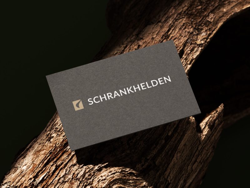
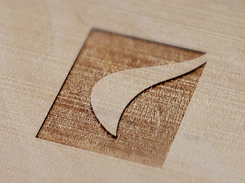
Instead of a colorful character, we’re now using a minimalist, geometric logo in charcoal and gold—more understated, more sophisticated, yet clearly recognizable. The lettering has also been redesigned: simpler, cleaner, and free of playful elements. In short: less flashy, more substance. The new visual identity is designed to reflect what our customers experience at every appointment—craftsmanship, reliability, and a level of quality that we now position as significantly more exclusive than when we were founded seven years ago.
The cloak is still there—you just have to look more closely
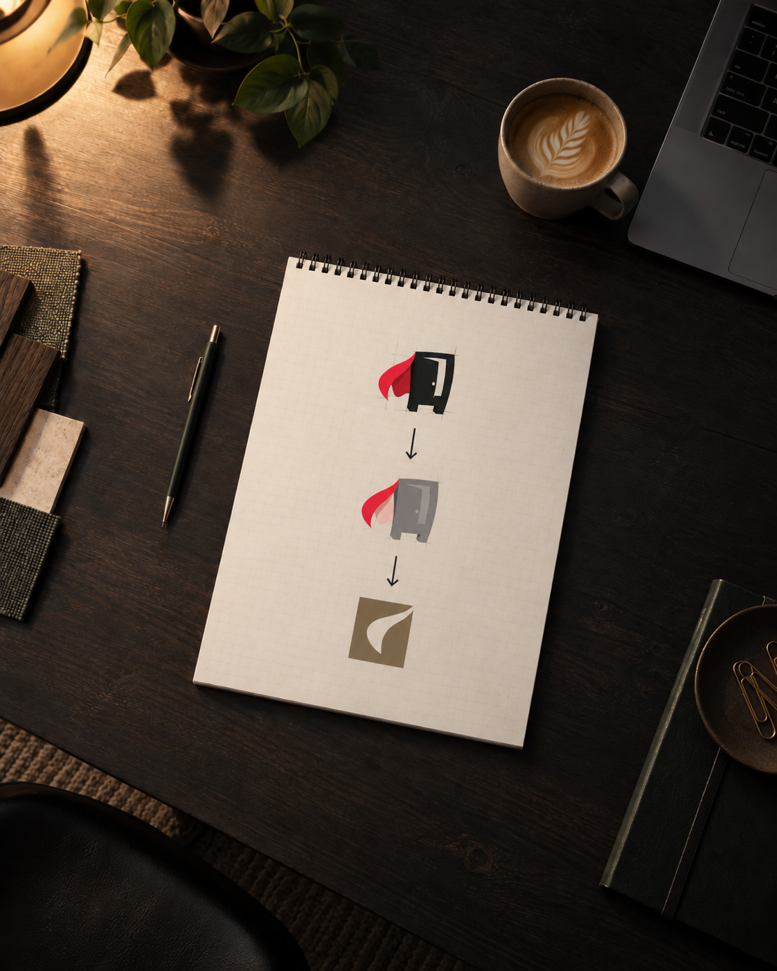
But we haven’t said goodbye to our mascot entirely. If you look closely, you can still recognize the silhouette of the cape in the new, abstracted logo—as a simplified, curved shape in the new icon. It’s a deliberate compromise between letting go and maintaining continuity: The playful comic-style character is a thing of the past, but a small piece of its history lives on in the new logo.
Here's how the transition will take place
Changing the logo for a network with over 50 tradespeople doesn’t happen overnight. That’s why we’re rolling out the new look in stages:
- Over the coming weeks and months, the new logo will be gradually rolled out on vehicles, signs, business cards, and digital channels.
- Until then, you may still come across the old logo on one vehicle or another or on a company sign.
- For a transitional period, both versions will be part of the brand on an equal footing—a coexistence that has been deliberately planned this way.
So if you see both the old and the new logos on our site over the next few months, it’s not a mistake—it’s part of the ongoing transition.
What Will Stay the Same for You
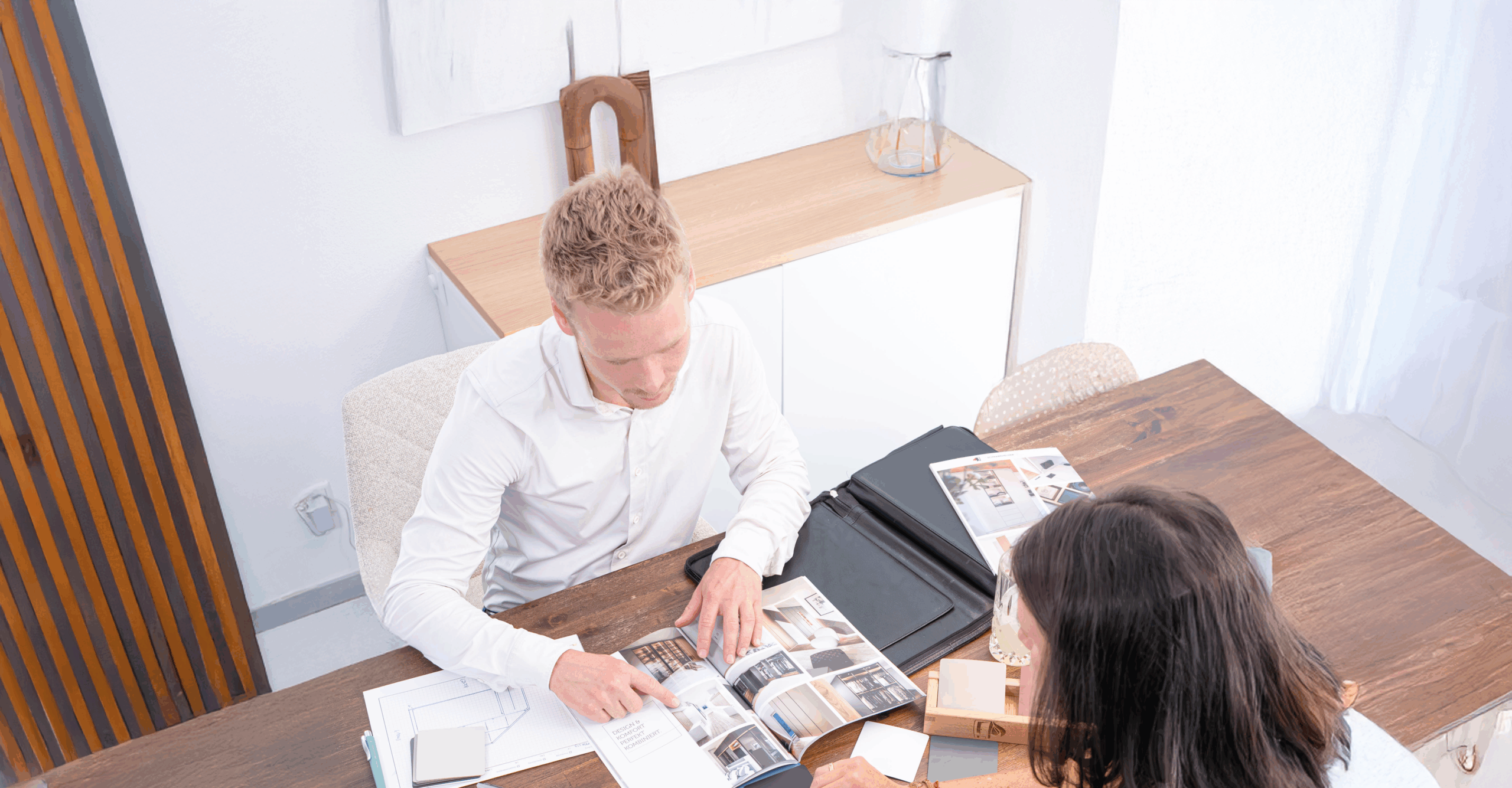
No matter how much our image changes—our core business and our standards remain the same. As always, we offer free, no-obligation consultations right in your home; a personal point of contact from your region; millimeter-precise measurements; and the craftsmanship of skilled carpenters and joiners—not off-the-shelf furniture. Our approach remains exactly the same as you’ve come to know from our previous communications and customer testimonials. Our company history and the values we’ve stood for over the past seven years also remain unchanged—just presented in a more contemporary way.
Your local contact person will remain the same; the processes—from the initial contact through the measurement appointment to installation—will not change; and the new logo has not altered our fixed-price promise with no hidden costs. For us, rebranding deliberately affects only our visual identity—not the craftsmanship behind it.
Conclusion: A new look for an established brand
Our logo has changed—less cartoonish, more sophisticated, but with a touch of whimsy in the form of the cape, which is featured in the new logo. For you as a customer, nothing has changed when it comes to what really matters: personalized advice, honest craftsmanship, and cabinets that fit your home perfectly. If you’d like to learn more about us and our history—or want to start planning your own cabinet right away—we’d be happy to set up a no-obligation consultation.
For press inquiries regarding our rebranding, please also visit our press section, where you can find direct contact information.