


For a long time, white was the safe choice for cabinets: bright, neutral, and uncomplicated. And that’s still true today. If you prefer a clean, minimalist, and timeless look, white remains a great choice.
But modern living spaces are changing. More and more people want a home that is not only neat and functional, but also feels warm, peaceful, and inviting. That’s exactly why soft, natural shades are gaining more attention: champagne, cashmere gray, stone beige, stone gray, dusty gray, and subtle pastel tones.
They have a subtle look, but appear softer than classic pure white. The choice of color is especially crucial for a custom-made closet, because a built-in closet is not just a piece of furniture—it defines the entire room.
Whether it’s a bedroom, hallway, walk-in closet, living room, or attic: The right cabinet color determines whether a room feels bright, cozy, elegant, or modern. And this is exactly where careful planning pays off.
White isn't wrong—warm tones just have a different effect
White has many advantages. It makes rooms brighter, gives them a tidy look, and goes well with almost anything. That’s why white has long been the standard choice for cabinets, built-in closets, and coat racks.
And to be perfectly honest: White isn’t going anywhere either. There are rooms where white works perfectly—especially if the room is small, has little natural light, or is intentionally designed to be very clean and minimalist.
However, a custom-built cabinet is often large in size. It can fill an entire wall, a niche, a hallway, or even an entire room. As a result, the color of the cabinet’s front has a much stronger impact than it would on a single piece of furniture. What looks neutral on a small swatch can have a completely different effect when spread over several square meters.
Pure white can look very clean, especially in modern living spaces with smooth walls, light-colored floors, and clean lines. That may be the intended effect. Sometimes, however, clients want exactly the opposite: more warmth, more tranquility, and more coziness.
This is where warm cabinet colors come into play. They remain neutral but have a slightly softer feel. They add depth to the room without being overpowering. Or to put it another way: White creates brightness. Warm neutral tones create atmosphere.
Beige, Gray, and Champagne: The New Neutral Cabinet Colors
Anyone who still thinks of beige as an old-fashioned cream color should definitely take a closer look. These modern, warm shades have little in common with the beige stereotypes of the past. They are more refined, calmer, and more versatile.
These five shades are particularly exciting:
Champagne
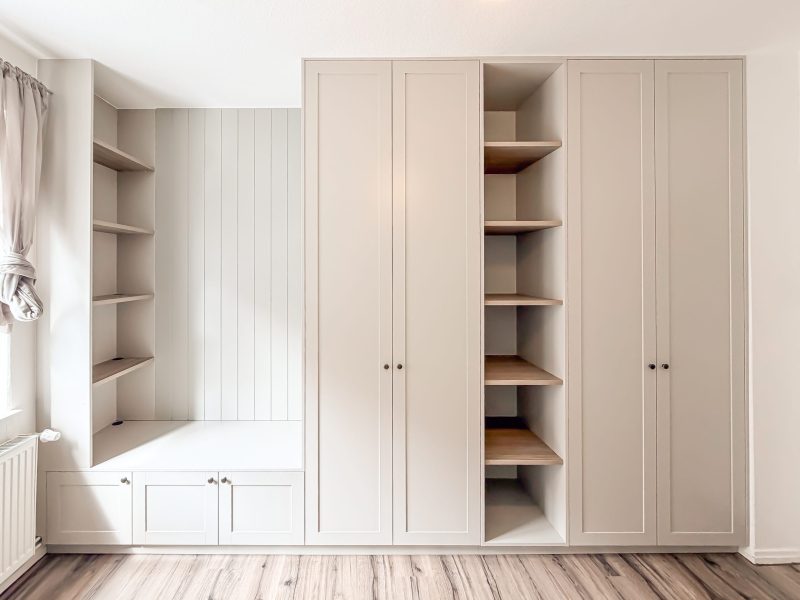
Champagne is a light, warm shade with an elegant feel. It’s inviting, light, and appears softer than pure white. Especially when paired with light wood floors, oak, indirect lighting, or natural materials, it creates a very harmonious look.
Champagne works especially well in the bedroom, the dressing room, or hallways that are meant to feel bright and inviting. The shade adds warmth to the room without making it feel visually heavy.
Stone Beige
Stone Beige has a natural, understated, and elegant look. The shade is reminiscent of stone, sand, and warm natural materials. As a result, it pairs very well with wood, natural stone, light wall colors, and serene interior design schemes.
A cabinet in Stone Beige doesn’t draw undue attention to itself. It blends in harmoniously while still making the room feel more thoughtfully designed. This is especially advantageous with large cabinet surfaces, because the cabinet appears less bulky.
Cashmere Gray
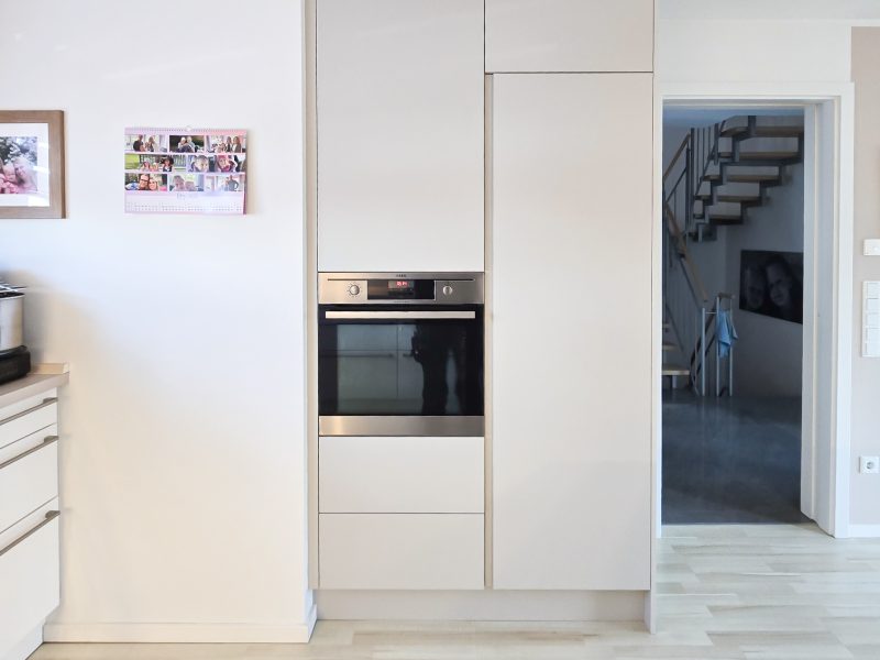
Cashmere gray falls somewhere between gray, beige, and taupe. This gives the shade a very calm, modern, and high-quality look. It is less cool than classic gray, but more neutral than a warm shade of beige.
Cashmere Gray is particularly beautiful for rooms that are meant to look elegant and understated. For example, it’s ideal for dressing rooms, bedrooms, wall units, or minimalist built-in closets. When paired with black handles, wood accents, or warm lighting, it creates an overall look of exceptional quality.
Stone Gray
Stone gray is slightly more neutral and cooler than beige, but less harsh than classic gray. It works well with modern architecture, clean lines, and spaces that are intentionally minimalist.
When paired with wood, stone gray feels cozier. With black handles or dark accents, it looks more modern. This shade is ideal for anyone who doesn’t want a warm beige but is still looking for an alternative to white.
Dusty Gray
Dusty Gray is a very subtle, understated shade of gray. It has a soft, calm, and unassuming appearance. Compared to Stone Gray, Dusty Gray is often a bit softer and less high-contrast. That’s exactly why it’s well-suited for cabinet fronts that shouldn’t appear too dominant.
Dusty gray pairs particularly well with light-colored floors, black accents, matte finishes, and modern interior design concepts. It also creates a beautiful balance when paired with wood: the wood adds warmth, while dusty gray brings a sense of calm.
The big advantage of these colors is that they’re neutral enough to stay in style for a long time. At the same time, they have a more unique look than standard white.
Why Warm Colors Work So Well in Custom Cabinets
A custom-made cabinet is designed specifically for your space. It makes optimal use of the available area and fits seamlessly into alcoves, sloped ceilings, or entire wall surfaces. That’s exactly why the color scheme is so important.
With a freestanding piece of furniture, color is a single design element. With a built-in closet, it becomes part of the room. The cabinet fronts can define an entire wall. They influence how bright, serene, open, or cozy a room feels.
Warm neutral tones have a major advantage here: they often blend more harmoniously with the floor, wall color, and furnishings. They don’t create a harsh boundary in the room, but instead appear softer and more natural.
It’s especially beautiful when color, material, and light come together. A champagne-colored cabinet with wooden slats and indirect lighting creates a warm and cozy atmosphere. A Stone Beige coat rack with an oak seating niche looks high-quality and inviting. A cashmere gray walk-in closet with illuminated open shelves exudes a sense of calm and elegance.
So it’s not that white is worse. It’s about the atmosphere you want to create in the room.
Pastel colors: used sparingly, but with real impact
In addition to shades of beige and gray, soft pastel colors are also becoming increasingly popular. However, it’s important to note that when it comes to custom cabinets, pastel shades shouldn’t be used in a way that’s too whimsical. A custom cabinet will last for many years. That’s why the color should not only appeal to you today but also work well in the long run.
Muted shades are even more beautiful than very bright pastel tones:
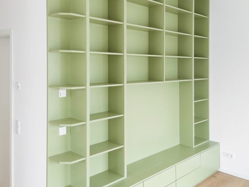
- Sage instead of strong mint.
- Blue-gray instead of baby blue.
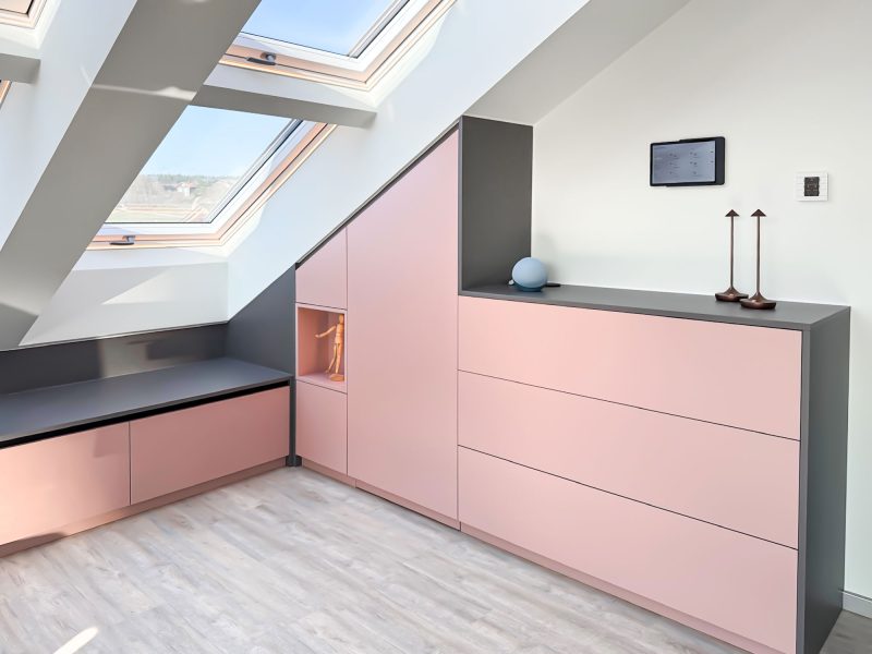
- Powder or dusty pink instead of bright pink.
- Buttercream instead of yellow.
- Mauve instead of purple.
Colors like these have a soft yet sophisticated look. They can add character to a room without making it feel cluttered.
Pastel colors work particularly well as accents. For example, on open shelves, a seating nook, individual cabinet fronts, or a built-in sideboard. This gives the cabinet a personal touch while still maintaining a calm and timeless look.
In a child’s room, pastel shades can, of course, be a bit more playful. Still, it’s worth taking a long-term view here as well. A champagne-colored closet with accents in sage or powder pink will grow with the child better than a completely colorful scheme.
Which color works best for which room?
bedroom
In the bedroom, a closet should radiate a sense of calm. Large cabinet fronts in a very stark white can sometimes appear cold. Warm tones such as champagne, cashmere gray, stone beige, or dusty gray create a softer atmosphere.
It looks especially beautiful with handle-less cabinet fronts, wood accents, or indirect lighting.
Hallway and Coatroom
The entryway is the first impression of your home. At the same time, it needs to be practical. Jackets, shoes, bags, and everyday items need space without making the room look cluttered.
Stone Beige, Stone Gray, or Dust Gray are good options here. They have a warm, modern look and are often less delicate than pure white. With a seating nook, a mirror, or open shelving, you can create an entryway that’s both functional and inviting.
living room
In the living room, storage should blend in as harmoniously as possible. A cabinet or wall unit can be practical, but it shouldn’t look like a purely functional piece of furniture.
Warm, natural shades work particularly well here. Champagne, cashmere gray, stone beige, or dusty gray pair beautifully with wood, open shelves, and lighting. This creates storage space that blends seamlessly into the living area.
Dressing room
A walk-in closet thrives on organization, light, and atmosphere. Cashmere gray, champagne, or stone beige look particularly luxurious here. Combined with lighted clothing rods, open shelves, or dark handles, they create an elegant look that feels significantly cozier than a purely functional closet solution.
Sloped Ceilings and Niches
When dealing with sloped ceilings and alcoves, the choice of color is particularly important. The cabinet should look as natural as possible, not as if it were added as an afterthought. Light, warm tones such as champagne, stone beige, or dusty gray can help make the cabinet appear lighter visually.
What to Consider When Choosing a Color
You shouldn’t choose the best color for your cabinets in isolation. You should always consider it within the context of the room. That’s because lighting, flooring, wall color, and existing furniture can greatly affect the overall look.
A color can look beautiful on a screen but appear quite different in a real room. Northern light often makes colors appear cooler. Warm artificial light can accentuate beige and champagne tones more strongly. The floor also plays a major role: not every warm shade automatically goes well with a yellowish wood floor. Sometimes a more subdued shade like dusty gray or cashmere gray strikes a better balance.
That’s why it’s worth planning the cabinet color along with the material, handles, interior layout, and lighting. Only when these elements work together does a harmonious overall look emerge.

Conclusion: The most beautiful color is the one that suits your home
Champagne, cashmere gray, stone beige, stone gray, and dusty gray are great alternatives to classic white. They create a modern, calm, and cozy atmosphere without being overpowering. Soft pastel shades can also add beautiful accents when used thoughtfully.
But in the end, there isn’t just one “right” color for your cabinets. There’s only the color that goes well with your room, your lighting, your flooring, and your decorating style.
Maybe it’s white. Maybe it’s champagne. Maybe it’s dusty gray. What matters is that the cabinet isn’t just practical—it feels as though it were made just for your home.
That’s exactly what a custom-made cabinet is for.
Your closet. Your color. Your home.
Not sure which color will work best in your room? Then planning it right on-site is the best way to go.
At Cabinetheroes, we take a close look at your space: the lighting, the floor, the walls, your existing furniture, and, of course, your preferences. The result is a custom-made cabinet that not only fits perfectly but also blends seamlessly into your home.
Whether it’s a built-in closet, coat rack, walk-in closet, living room cabinet, or closet for a sloped ceiling—together we’ll find the solution that suits your style.
Schedule your no-obligation consultation today and find the cabinet color that will make your home even more beautiful.

